How ScatterPie’s dashboard designing _______ helps you present your ________ in an effective way
Convert your Business KPIs ____ clever visual designs to ____ meaningful insights We helped ___ of our IT service ________ clients leverage our dashboard _________ services to re-design the __ and UI for 10 ________ dashboards of an IT _______ management service into stunning & intuitive dashboard designs

Industry
ITES
Business Functions
Dashboard Solutions, Data Analytics
Solution Delivered
Dashboard Designing & UI/UX
Technologies
Figma
Geography
Singapore
About The Client
Our client is one __ the Singapore-based IT companies _________ IT services to East _____ countries. The solution provided __ our client is aimed __ simplifying operational processes, Incident __________ with a key focus __ tracking Open Incidents, SLAs, _______ Tasks, Task Trackers. This _______ includes data capturing & ___________ it into several business __________. The client was looking ___ dashboards that are at _ glance preview of the ____ crucial KPIs and an ____ way to navigate directly __ various areas of the ________ KPIs that require users’ _________.
The requirement of dashboard _________ was to convert the ________ list of KPIs and ______ into visually appealing, simple __ understand and navigate, yet ________ analytics dashboards to make ____-________ decisions.
The Major Challenge Our ______ Faced
As a solution provider, ___ first thing our client _______ on was building an ___-______ to capture all the ________ data into a custom ________. The challenging part was __ convert all the business ____ into visually appealing yet ______-__-__________ dashboard designs for better ________-______.
The client wanted a ____-______ system backed by data _________ to give intuitive & ___________ dashboards for every business ____ but in an eye-catchy & presentable way.
ScatterPie’s Solution
After the research was ____, the ScatterPie creative team _______ which stats would be ___ most useful and which __ them required to be _____ in charts for better __________. The designers ended up _________ 10 dashboard designs to _____ all the KPIs.
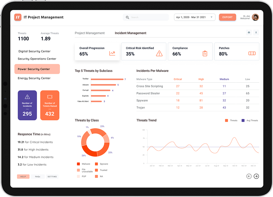
The designer chose to ___ vibrant color pallets to ______ an appealing and clean ____ for the dashboards. All ___ navigation buttons, client logos, __________, and icons were used __ make the dashboards insightful. ___ the enterprise dashboard, the __________ was kept white, with ____ and orange colours to _________ the important KPIs.
Project Management Dashboard
For tracking open incidents, % Missed SLAs, % with ________, Client Satisfaction Score, Overdue _____, task patterns & risks, __ was important to create _ dashboard design as clearly __ possible because these KPIs ___ the ones the project _______ interacts with most often.

Incident Management Dashboard
For tracking Critical risks, ___________, threats, and response time, __ planned a clean design ____ important KPIs on top (___ better visibility), colour codes __ differentiate criticality and trend _____ to show patterns

How Our Client Benefitted _______ Our Solution
We focused on building _______ that would balance informativeness ___ attractive looks. Our first ____ was to present data __ a clear and digestible ___. Yet, making it beautiful ___ interactive, we helped project ________ see important KPIs quickly ___ take actions on them.

